Sunday, July 24, 2011

Experiments and Developments in Studio Furnishings

Note: If you're looking to read things about the mysical/revered/ineffable creative process, there won't be much in this post for you. If, on the other hand, you geek out over minuscule technical developments and love seeing how other people function on a practical level in their studios, then read on!

The first big deal in the studio is that I replaced my many-years-old Liquin squeeze bottle solution. Backstory: I love Liquin, but I like to get it in the big 1-liter glass bottle, the top of which gets all gunked up over the course of opening and pouring and closing repeatedly. Plus, you have to shake it like an uncooperative ketchup bottle. I actually emailed Winsor & Newton a few years back, asking if they knew anything about Liquin's interaction with plastics, as it's a petroleate. They had no idea; I was on my own. So I got a squeeze bottle made of that sort of gummy soft plastic. And it worked fine, for a long time.
Old Liquin Bottle (Deceased)
There was clearly some air communication through the walls of the container, causing a skin to form, but in the basement studio, where the temperature was really controlled and the air a bit humid, it wasn't much of an issue. Scene change to NYC, cue heat wave. The skin formed so fast that it was just a waste, and then the squeeze bottle split up the side in a final throe of death.

In search of a new bottle -- and quickly -- I came upon an almost-empty ketchup in the fridge, contained in the new Top-Down bottle from Heinz. Thank god for food packaging innovations (I'm only half sarcastic here). It's kind of perfect. The plastic is rigid, not gummy, but squeezable. (I don't know my plastics, but the recycle code on it is 1 and it says "PETE" below. Does that mean it's PET plastic? I don't know. I could probably google it, though. The previous squeeze bottle didn't have a code.) And of course it's meant to stand upside down so it's always ready to dispense. And it has a valve! Actually, the valve has been a bit problematic, because the Liquin has been wanting to separate lately, perhaps because of the heat, but I'm finding a good violent shake does the trick. And the best part is: no skin has formed yet. Even through our patch of 100-plus-degree days. I think I've found a winner.
Heinz Top-Down Ketchup BottleHeinz Top-Down Bottle Repurposed as Liquin Dispenser
Heinz Top-Down Bottle Repurposed as Liquin Dispenser

Second on the list of neat experiments is a custom oiling-out formula I put together. On the wallpaper painting, I was having a terrible time with glare on the darker edges. Even using my photographer's even lighting we couldn't get it to photograph sufficiently well. Furthermore, this is one of those things that I just have to troubleshoot because it becomes a problem on all my work. Not having had a very good technical painting education, I hadn't heard of oiling out. But, thanks to YouTube, I had subscribed to Gamblin's feed, and they had recently put out a video on the topic. (I was on a YouTube kick for a while, so I watched that, and about a million other things, including Art21's new series, which is totally worth a look.) A good artist-friend of mine had also passed along the tip that Lavender Spike Oil was supposed to reduce shine on dark areas when used as a medium. So I hodge-podged together a recipe for my own oiling-out solution, hoping for a finish would be even and maybe a little satin.

Collection of Painting Mediums

    My recipe is as follows:

  • 1 part Odorless Mineral Spirits (1 small pour, maybe a tablespoon? two?)

  • 1 small lump Cold Wax Medium (lima bean size)

    Smash and stir til dissolved.

  • 1 part Galkyd

  • 1 1/2 or 2 parts Lavender Spike Oil

    Then you brush it on evenly and rub it in with a cloth (cheesecloth, ideally) using circular motion.

It definitely seemed to help considerably. Now the painting is at the photographer's again, and I'm awaiting results. She may still have to use polarizing filters to get it just right on film, we'll see. But I have high hopes. And already the in-person experience of it is improved, the colors glow and the corners don't glare. (Storing the leftovers in a tin can with plastic wrap, however, was a failure. I got a glass jar with a rubber seal for storing future batches.)

Development number 3 involved a trip to Ikea. The Brooklyn store is kind of a hell-hole, and that's not just because I'm partial to the Portland one. But we drove out over the Brooklyn Bridge, and coming back into the city the view was just beautiful, so the trip was arguably worth it just for that. It's funny to realize that there's a lot of the city I haven't actually seen, despite having traveled past/through it, because I'm so often underground. It feels like a strange treat to be in a car.

Anyway, we made the Ikea trip because I've had my eye on the Bygel cart since before I moved.
New Painting Cart
New Painting Cart
It's very compact, not too rickety, and only $30. Hard to argue. I also got some glass shelves to use as palettes. It's so nice to be mixing on glass again. Plus, I have my desk area back, now that my palette and brushes are all loaded onto the cart. I can't help but miss my old painting cart, with it's 4 swiveling wheels and hugeness, but for my current space this is a vast improvement.

The last and most recent development is that we finally got sufficient air conditioning installed to deal with this heat wave. And it's been glorious. I can finally paint without dripping sweat, and without my paint literally drying on the brush. Oh, a/c, how I love thee.

Wednesday, July 13, 2011

More Clippings

Visual troubleshooting. Jumpstarting. Things I'm looking at right now.

Nicolas Holiber is inspired by meat.

I know nothing about this image (except that it's by Annika von Hausswolff; via mounts tumblr).

Steve Budington paints bodies. Sort of.

Monday, June 27, 2011

Clippings

Things are moving along here in this New York adventure. Two months in, and it looks like I'll be joining the ranks of the employed day-jobbers. More details when they're set in stone.

Exhibition news should be coming soon, as well as a new print.

Until then, here are some of the lovely things that have been saturating my retinas lately...

Eliot Lee Hazel's work is astoundingly beautiful. Ethereal, ambiguous, but captivating. I especially like his Moby Ohno set, from which this first image comes.
See this image in motion in the Moby Ohno video teaser here.


Also on the radar are three artists from the Columbia University 2001 MFA Thesis Exhibition:

Chris Jehly comes from the world of or is at least strongly influenced by street art. Dude knows what he's doing with line. Of course, the pieces he had in the MFA show aren't online anywhere (that I can find) which is a shame.


Brie Ruais is a sculptor working primarily in ceramic and plaster. And, sometimes, sticks. I don't like all of her work, but what I like, I like a lot.
"Undoing Persephone", 2011
Plaster, fabric, steel, wood, found branch
(included in MFA Thesis show)
"Weighted by the Sunset", 2010
Plaster, pigment, fabric


The third is Joseph Michael Lopez, a photographer working in a somewhat journalistic style, I suppose. I mean that in the sense that he shoots the world around him, people on the streets, etc., rather than setting up shoots or creating worlds. His shots still have that dreaminess to them, though. Apparently that's what does it for me in photography. His site is flash, which means I can't pull images. But go look at it anyway... The link above goes straight to my favorite shot of his.

And then, last but of course not least, is the Alexander McQueen show at the Metropolitan Museum of Art: "Savage Beauty."

Overwhelming in the best way. Past his mastery of the craft, of tailoring itself, McQueen was undeniably an artist. These things he created are sculpture as fashion, or fashion as sculpture... The pieces and other artifacts were supported by video of some of the runway shows. McQueen runway shows are not exactly your run-of-the-mill, walk-and-turn shows, and seeing the garments in his version of motion was very informative. (Runway shows can be viewed in the Runway Archive.) The presentation of his collections grouped more by theme than by seasonal collection, which made it more difficult to get a clean chronological grasp of his work, but was incredibly useful as a source of inspiration.

Tuesday, April 26, 2011

Jumping With Both Feet

Hey there. Long time no see. How've you been? Oh, what's new with me? Well... I moved to New York City. Last Friday.

When the subject comes up, total strangers and close friends alike seem surprised that I would ever leave Portland. Why? they ask. Portland's so livable. New York is sooo expensive! My answer is, mostly, that it was just time. Things lined up, opportunities presented themselves, doors swung open. And the truth is that, although the art world is decentralizing, New York City is still its center. Plus, if I can make it here, I can make it anywhere.

Projects on the horizon include:
- renewed commitment to the Gloriously Awash in Sin blog, possibly with a more fictional direction from Casey Plett;
- a food/kitchen macguyver blog project with Stephen Moles (details yet to be hashed out);
- and of course, a whole new set of paintings.

As my life started to seriously change direction in Portland, so did my painting. If you follow me on flickr, you will have seen some of my new work in progress. That's where I'll be starting when I get the studio up and running here... and then I'll just follow it where it takes me.

One day at a time.

Monday, October 11, 2010

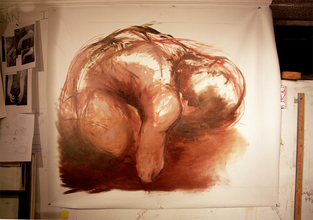
New work in progress: 'Curl'


For now I'm calling it "Curl." (Now that I'm taking progress shots of my paintings, I have to give them some sort of working title so I can make a folder... damn you technology.) Finished dimensions will be about 44"x36" I think.

I like the linear/gesture quality at this point. Not what I had originally envisioned, but now I don't really want to lose it... The constant battle between the image in my head and what comes out on the canvas. I wish I knew more what I was doing when it comes to the figure, on an anatomical/technical level. Should've paid more attention in figure drawing (or kept in practice after the class ended). I've been thinking I really need to start getting myself to the Hipbone every now and then.

In other news, I finally broke down and bought a roll of pre-primed canvas with my last Blick order. This is my first painting on it. No complaints so far, except that there's less procrastination I can get away with... Feels pretty heavy duty, so we'll see how it stretches when we get there.

Thursday, October 7, 2010

On Femininity

A friend of mine, who identifies along the transgendered spectrum, wrote in a recent piece that he intends to physically transition in the next year or so. I have been aware to some extent about his progress in that direction (and have a love and affection for him that is, as I have told him, "outside of gender," something I really can't say about anyone else I have known) but for some reason this timestamp, this statement that he's not just going to float about in the middle between genders, has thrown me for a loop.

I think it is because it comes crashing up against recent understandings I've come to have about my personal affiliation with femininity and its role in my artwork.

I've never considered myself particularly feminine. An only child to a father who I suspect would have been much more comfortable having a son, I was raised somewhat like a son. Not to say that he denied my being a girl, but we bonded via power tools. He is the reason that I have an extensive power tool collection today. My mother raised me pretty gender-neutrally as well -- I suspect that, in her mind, being a girl child equated to a very painful experience, so she was conscious not to pass that on.

Jump forward to the current day, my artwork is arguably one of my most feminine expressions of self. Lots of pink, and flesh, and sexuality. Looking at the subject matter itself, it's very much about the physical component of being female: female genitalia, breasts, the consequences inherent in a uterus (birth, cramps, blood). Only sometimes does it break past the purely physical into something bordering on societal: excessiveness versus voluptuousness (fat is a very culturally baggage-laden subject, especially where it intersects with the feminine); the binding or hanging of the flesh, which can be interpreted in a myriad of ways, whether gendered, relating to the 'human condition,' socio-economic, emotional, etc.

A work in progress. Ostensibly having to do with the heart, but just as much (for me, at least) about menstrual cramps and the sort of reoccurring, copious blood that is part of the female experience.

So now, mentally juxtaposing our two versions of femininity, my friend's and mine, I don't know what to make of it. His wardrobe is far more feminine than mine; my sense of femininity is mostly related to the anatomy over which I had no choice in being given. Like if you could blend us up and edit out the incongruous parts, we could be a 'complete woman' in both gender expression and biological senses.

Maybe I shouldn't make anything of it. Maybe that's the point of all this, to show me how irrelevant these culturally-loaded terms can become in the face of very real personal experience. How diverse personal experiences really are, and how insufficient language is to express them in their fullness and nuances.

But this friend of mine would probably have something to say about that -- he is a writer, after all.

Thursday, September 2, 2010

Little synaptic sparks of memory

I've had quite a surge of inspiration/impetus to paint lately, but of course, the nature of such things is that they ebb and flow, wax and wane. And now it has waned a bit (in part because I have new painting ideas, but must gesso more muslin to get started... puts the brakes on a bit).


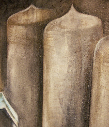
Tonight, to fill the void of inspiration, and the time between coats of gesso, I've gone back to working on the second Hemlock Semiconductor commissioned painting. I feel like it's going in a really nice direction, one that I didn't have much trouble picking back up on even though it's been a little bit since I've touched it. Plus, I have to say I welcome the technical challenge of this one in particular. The transparency, slight waxiness, and internal structure of the quartz still has me baffled -- I'm currently just glazing layers of semi-transparent color and hoping that something strikes me. And the polysilicon ingots, though much more of a predictable geometric and solid shape, still make me think hard due to their changing angles and the sheen of their surface. I've always had a hard time with surfaces and sheens in paintings; all of my textures come out the same. But I'll be very surprised if I haven't improved that particular skill by the time this one's finished.

Blocking in the silhouettes of the furthest-back ingots, I got a memory flash of Charles Demuth's "My Egypt," which I once wrote a paper on for Art History class. Something about the current flatness and linearity of the ingots, and their shape, similar to grain silos, and the general verticality, I suppose. Clearly not very similar paintings, but the connection made me smile.

Charles Demuth: "My Egypt," 1927, oil on composition board, 35 3/4 x 30 inches