Showing posts with label inspiration. Show all posts

Saturday, November 5, 2011

Histories, Arcs, and Works in Progress

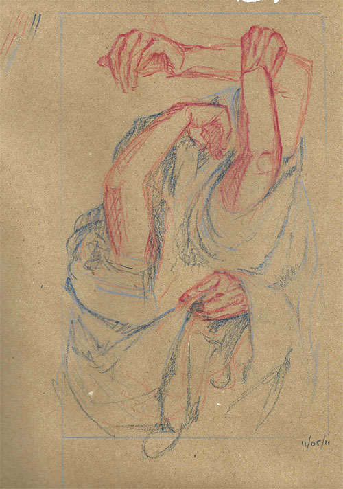
Composition/idea/approach exploration sketch for a project I've been referring to as The Dress Paintings.
Pastel pencil on kraft, 9"x12"
November 2011

Sometimes I'll do a sketch or work through an idea only to realize later that I'm pulling from ideas I've already seen or worked with and forgotten about.  This has been happening a lot lately.

Here, a sort of simultaneity/non-linearity of time, explored through a montage of arms and hands, using photographic references but creating composites by hand rather than digitally.  The result sparked a memory of a hand montage from over 6 years ago.  Recurring imagery for me, apparently.

Montage of Jason's hands
Ink and oil on bristol paper, 11"x14" (?)
June 2005


Also, no doubt influenced by the Jenny Saville show at the Gagosian, where she composited drawing atop drawing, redrawing/correcting portions in addition rather than in substitution.

Installation view
2011

Thursday, September 22, 2011

Wild sparks like fireflies

I'm not the only one looking at balloons...

Robert Jackson, Balloon Race
oil on linen, 48 x 48 inches
2009

Robin Willliams, Place Holder
oil on canvas, 48 x 54 inches
2008

Sunday, September 4, 2011

Balloons.

I've recently developed a slight obsession with balloons. Basic party balloons from the dollar store. Quite possibly because of the image from two posts ago with the arms wrapped around that big balloon-like thing. But also, maybe, because at our cramped corner dollar store the party section is right at the door, so all of a sudden balloons are literally on my radar.

(They've actually been on my radar intermittently for years, in experimental sculptural/installation work that I failed to document. At the time, I wasn't really taking it seriously because "I don't do sculpture." I've been kicking myself pretty hard for the past month or two. Lesson learned.)

They've become this vehicle for working through ideas, at least in my head, showing up in two recent proposals/applications. The idea is that I'll use them as still lifes to draw from directly, and also as photography subjects to build a collection of images to paint from. Sort of like taking the Of Flesh and Fruit project all the way to fruition in paintings. But I'm still figuring out how to work with them adeptly in real life.

Balloon still lifeBalloon still life, close up

Right now they're getting pinned to the wall of the studio in joyously cancerous little clusters. They make me think a little of Ross Bleckner's early stuff (who, by the way, has been letting Art Blog Art Blog use his Manhattan studio space for gallery shows while he's at his studio out in the Hamptons or wherever).

Balloon study 1Balloon study 2

I've been doing some basic skill-building type drawing, just getting used to working from life again instead of just out of my head or from a flat image. What's coming out isn't exactly prodigious, but at least I feel like I'm getting somewhere.

I feel like there's something right around the corner as far as the work is concerned. I feel like I'm on the verge of finding something really fruitful, this thing that maybe I've been looking for all along. And then I get swallowed up momentarily by this worry over whether what I'm doing is worth doing at all. And then I realize that maybe this feeling, this being on the verge and wondering if it's actually there, maybe that's what this whole thing is about. Maybe I just need to get used to that feeling, because it's certainly the most purposeful and excited I've felt in the studio in quite a while.

Wednesday, July 13, 2011

More Clippings

Visual troubleshooting. Jumpstarting. Things I'm looking at right now.

Nicolas Holiber is inspired by meat.

I know nothing about this image (except that it's by Annika von Hausswolff; via mounts tumblr).

Steve Budington paints bodies. Sort of.

Monday, June 27, 2011

Clippings

Things are moving along here in this New York adventure. Two months in, and it looks like I'll be joining the ranks of the employed day-jobbers. More details when they're set in stone.

Exhibition news should be coming soon, as well as a new print.

Until then, here are some of the lovely things that have been saturating my retinas lately...

Eliot Lee Hazel's work is astoundingly beautiful. Ethereal, ambiguous, but captivating. I especially like his Moby Ohno set, from which this first image comes.
See this image in motion in the Moby Ohno video teaser here.


Also on the radar are three artists from the Columbia University 2001 MFA Thesis Exhibition:

Chris Jehly comes from the world of or is at least strongly influenced by street art. Dude knows what he's doing with line. Of course, the pieces he had in the MFA show aren't online anywhere (that I can find) which is a shame.


Brie Ruais is a sculptor working primarily in ceramic and plaster. And, sometimes, sticks. I don't like all of her work, but what I like, I like a lot.
"Undoing Persephone", 2011
Plaster, fabric, steel, wood, found branch
(included in MFA Thesis show)
"Weighted by the Sunset", 2010
Plaster, pigment, fabric


The third is Joseph Michael Lopez, a photographer working in a somewhat journalistic style, I suppose. I mean that in the sense that he shoots the world around him, people on the streets, etc., rather than setting up shoots or creating worlds. His shots still have that dreaminess to them, though. Apparently that's what does it for me in photography. His site is flash, which means I can't pull images. But go look at it anyway... The link above goes straight to my favorite shot of his.

And then, last but of course not least, is the Alexander McQueen show at the Metropolitan Museum of Art: "Savage Beauty."

Overwhelming in the best way. Past his mastery of the craft, of tailoring itself, McQueen was undeniably an artist. These things he created are sculpture as fashion, or fashion as sculpture... The pieces and other artifacts were supported by video of some of the runway shows. McQueen runway shows are not exactly your run-of-the-mill, walk-and-turn shows, and seeing the garments in his version of motion was very informative. (Runway shows can be viewed in the Runway Archive.) The presentation of his collections grouped more by theme than by seasonal collection, which made it more difficult to get a clean chronological grasp of his work, but was incredibly useful as a source of inspiration.

Thursday, September 2, 2010

Little synaptic sparks of memory

I've had quite a surge of inspiration/impetus to paint lately, but of course, the nature of such things is that they ebb and flow, wax and wane. And now it has waned a bit (in part because I have new painting ideas, but must gesso more muslin to get started... puts the brakes on a bit).


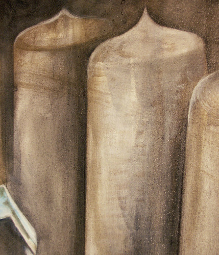
Tonight, to fill the void of inspiration, and the time between coats of gesso, I've gone back to working on the second Hemlock Semiconductor commissioned painting. I feel like it's going in a really nice direction, one that I didn't have much trouble picking back up on even though it's been a little bit since I've touched it. Plus, I have to say I welcome the technical challenge of this one in particular. The transparency, slight waxiness, and internal structure of the quartz still has me baffled -- I'm currently just glazing layers of semi-transparent color and hoping that something strikes me. And the polysilicon ingots, though much more of a predictable geometric and solid shape, still make me think hard due to their changing angles and the sheen of their surface. I've always had a hard time with surfaces and sheens in paintings; all of my textures come out the same. But I'll be very surprised if I haven't improved that particular skill by the time this one's finished.

Blocking in the silhouettes of the furthest-back ingots, I got a memory flash of Charles Demuth's "My Egypt," which I once wrote a paper on for Art History class. Something about the current flatness and linearity of the ingots, and their shape, similar to grain silos, and the general verticality, I suppose. Clearly not very similar paintings, but the connection made me smile.

Charles Demuth: "My Egypt," 1927, oil on composition board, 35 3/4 x 30 inches

Friday, August 27, 2010

George Saunders on allegiance to one's style

A writer-friend of mine, Casey Plett, turned me on to this project a classmate of his at Columbia is working on called The Days of Yore. It's a collection of interviews with various writers (and a few artists, musicians, etc., but mostly writers) about the days before they were famous/acclaimed and whatnot. It's fairly run-of-the-mill content-wise, but has this 'talking shop' feeling that is generally lacking from more public-interest type interviews. After all, it's writers talking to writers, so the combination of articulative skill and a deep connection with the creative process results in a pretty successful finished product. (I feel like I get more out of these writer-to-writer conversations than I would get out of an equivalent artist-to-artist interview specifically because of the skill of articulation that writers necessarily have... We visual artists are not necessarily the best of wordsmiths, let's admit it.)

Anyway, the most recent installment, interviewing George Saunders (who to be quite honest I've never heard of) included this statement, which struck me as being particularly relevant to my current style/subject shift: "...At any given moment, certain styles are going to seem more urgent and truthful. So the trick is not to get fossilized in something you’ve already done, out of some sense of allegiance to 'your' style."


In the most recent manic, figurative painting phase, I've been painting frantically at night, listening exclusively to Floater's Stone by Stone through headphones (headphones give a much more thoroughly insulated feeling than speakers in that they block out all ambient noise -- footsteps of A headed for the bathroom, dog nails across the wood floor -- and allow me to be contently straight-jacketed inside my own head), photographing the stages of each painting diligently, but otherwise avoiding looking at them. Especially in daytime. During nighttime, I've decided, my mind accesses this whole other part of itself, and the resultant mind-hand coordination is way more direct.

Not that it means I have any idea where it's going. That's the motivation behind not looking at the work except when I'm working on it. Trying to not second-guess myself. Trying to let my gut have its way with the world.

Wednesday, February 3, 2010

Inspiration for February

My trainer posted this on her blog, but it has some seriously wide-ranging relevance. I'm taking it as my motivational/inspirational point for February.

I love what he says about talent versus skill, backup plans, being realistic, and obsessiveness.

Friday, January 29, 2010

Shipping Container Pipe Dream

Raw and gravity-defying
I've really been digging shipping container construction lately. I like the aesthetic, industrial and sort of a la Brooklyn / Williamsburg artist warehouse lofts when it was still all rough, before the developers got ahold of it.


Actually made of shipping pallets and trailer homes, respectively.
I really like the aesthetic of the buildings by Infiniski, a company operating out of Spain and Chile. Their whole focus is on the re-use of materials... containers, pallets, etc. I love the way they maintain the aesthetic influence of the original material. Probably my favorite is their "Forest House" on their site (which is all flash, so I can't pull the image). Go look at it!

I also like Lot-Ek's CHK (Container Home Kit). Scalable and flexible, with lofts and catwalks to boot.

Lot-Ek's Puma Building. The front is very similar to their CHK design.


And I really love what Canadian Designer Kieth Dewey has done with his Zigloo home. He really maintained the industrial elements, even using chain link in the interior and salvaging stairs from another industrial building. Plus, he has an extensive photo gallery of various phases of building.
The Zigloo's front steps


Despite the quantity of imagery available, there seems to be very little in the way of how-to information. Shed and Shelter has a pretty good list of companies who actually do things related to shipping container (or ISBU: Intermodal Steel Building Units) construction, rather than individuals or small groups who have done one-time projects or experiments. I just found out Google Sketchup has a whole section on container housing. I'll probably be browsing that a lot...

But of course, lack of information hasn't kept me from designing my own dream studio made out of containers. Nowhere to put it yet, but hush, reality. Dream a little dream with me...

Sunday, January 17, 2010

Way to go, paper!

(Via Facebook --> Craftzine --> All About Papercutting)

(Via Zuzutop) Totally worth a click the the original article to see all of the amazing paper awesomeness!

Thursday, November 19, 2009

Holiday Cards are here!

A few days ago I finished printing my holiday cards; they're currently arriving at select stores around the country! And of course, they're also available on my Etsy storefront.


I also want to share with you another little project I've been working on. My friend 'Casey' is in New York getting his MFA in writing at Columbia -- we had talked about doing some sort of art & writing collaborative project, but it wasn't until he swapped coasts that we actually got around to it.
The result is Gloriously Awash in Sin. The basic premise is that we each respond to the other's postings in our own art form, a vehicle to keep the creative juices flowing. We have declined to state any particular limitations, and have agreed that our pieces need not be polished (because we are both the type that can go back and edit endlessly). Enjoy!

Tuesday, October 13, 2009

Fall has... Fell. Felled? Fallen?

I recently printed up a small run of birthday invitations for a friend's daughter -- my first custom design for a child. Expectedly, it's quite different doing a youth design compared to doing a wedding, but what surprised me more was how different it was to do a design for a specific kid, rather than just for "kids." Normally I think of kid-oriented design to be too saccharine, too bright, or overly Swedish-inspired for my taste (I get my fill of swedishness working for the big blue-and-yellow box) but this design came out a little edgy, I think. Or maybe a little 80s. I couldn't help but fall back into memories of Paula Abdul songs and that unforgettable skate rink smell (ancient chewing gum ground into little black spots on the carpet + icee machines + preteen hormones) at the mention of a roller skating party.

In other news, I have a new silkscreen print in the Family show at Launch Pad. Like much of my work, it came about spontaneously and left me to figure out what it was about on my own. I'm still not sure I have a good answer for that, but in order to title it I interpreted it in relation to the Family show. In Latin. It's called Excisum Meus Fratres, Puer Sola Ego Sum, meaning (I think), "My Siblings Having Been Lost, I Am An Only Child," which makes reference to the fallopian pregnancies that preceded and followed my birth, rendering me, irreversibly, an only child.

And last but not least, I've had two pieces accepted into a recent graduate show at Portland State. More details to come...

Thursday, September 24, 2009

Size does matter.

Sometimes I get annoyed at things labeled 'handmade' that really aren't. Computer printed cards and "limited edition prints" are my personal pet peaves. But it seems that for many mediums, there's simply a lack of understanding. How can you really grasp difference between a screenprinted card, a letterpressed card, and a digitally printed card, or a handbound book versus a commercially bound one, if you don't even have a vague understanding of the mechanical processes involved?

So it was really refreshing to see some shots from the Ink & Spindle studio showing their printing process. (Their site has a few images; their flickr has many more)
Fantastic work, a studio to die for, and ethical working methods. I think I'm in love.

Thursday, April 9, 2009

Yes, I am a carpenter's daughter.


"Hemlock 82" print by Bryan Nash Gill, at Ashes & Milk

These are absolutely beautiful. I'm not the art-buying type, but every so often there is something that I would love to share my space with on a regular basis, and this, I believe, is one of them.

Also, as a lover of things handmade with care, such as good woodworking, I have to appreciate his technique. These are wood block prints in the utmost sense.

Saturday, March 28, 2009

Happy Birthday To Me!

In honor of my birthday (which was yesterday) I printed up birthday cards! The design is a drawing I made a little while back, but finally got around to printing, and the printing itself was actually quite fun. I mixed the ink live while printing, so they're all a little different, and sometimes there are neat streaks of color.

I also had breakfast this morning with my friend-turned-consultant Tiffany. She's talented, and super-inspiring, and just gets my gears turning. It was really great. A nice pick-me-up on a rainy day. I feel freshly motivated.

Then I talked to my dad, and did my best to pay that motivation forward. He owns his own business as a housepainter/carpenter, and with the housing market (and the economy in general) in the tank, he's having a hard time making ends meet. We talked a little bit about a few jobs he's been working on, mostly custom woodworking of the problem-solving sort... Long story short, I'm going to whip him up a little portfolio website to showcase his custom woodwork because that's where his real talent - and passion - is. Plus, lots of guys can paint a wall, but not everybody can make great architectural details and furniture.

We also talked about how the down economy presents us small business owners with an opportunity (however forced it may be) to really look at our operations, specifically our weak spots, and see how we can improve. The work is slow, so at least there's time to disect all the little bits... and hopefully we'll all come out the other side having survived and improved because of it. But it takes commitment and determination - and a willingness to really examine and admit your own weaknesses - to do it.

Saturday, January 24, 2009

The Web Is A Wonderful Thing

Looking around for retailers to approach, I found the ReForm School. Awesomeness. Seriously.

A few favorites:


"Grow" Tee by Ryan Jacob Smith
(a portland artist)

"San Shui Nocturne 2" by Yu I Chan
(gocco print)

"Every Card You Need This Year"
(this is just a great idea)

Lorena Barrezueta Gourmet Collection
(porcelain)

Now go out and buy something. Help out the economy by supporting your local (or not so local) artist(s).

Saturday, December 20, 2008

Art Nouveau Room Screen

A couple days ago I finally finished this room screen painting project that I've been working on for FOR. E. VER. But it's done, and gorgeous. I'm very satisfied. And its owner took it home and loves it as well, which is even better. And now, I'm obligated to post pics -- which really deserve a full view.

As if getting a project done isn't sufficient reward in itself, I also got about a third of my painting studio back (the screen took up the whole end wall) and I can get back to painting in oils (the screen was all acrylics).

That's not to say it wasn't fun, though, and a nice departure from my "normal" painting style. It was also really fun to make something specifically designed for someone's personal space. The person who commissioned it left it very open as to what I was to do, except that copper is her favorite metal. So I took a poster she had of the Eiffel Tower being built and used that as my starting point. It inspired me to look at the Art Nouveau style entrances to the Paris metro, and other architectural details from that period. I only realized later that it would go particularly well with many of the paintings she has throughout her place, which are sort of Impressionist style.

This project actually reminded me a lot of set painting, which I haven't gotten to do for years now -- without the reassurance that "it only has to look good from far away." Needless to say it brought out my perfectionist neuroses, as evidenced by the fact that I painted most of it with a quarter inch brush. But it turned out great. And I actually finished it, which is (sadly) more than I can say for many of the project I start.

Oh, before I go I should post a pic of my latest greeting card. I'm working on some other designs, but I don't expect them to be done particularly soon. But the ones that do exist are all available for purchase now in singles and 5-packs on my etsy: carlybodnar.etsy.com. Enjoy!