Note: If you're looking to read things about the mysical/revered/ineffable creative process, there won't be much in this post for you. If, on the other hand, you geek out over minuscule technical developments and love seeing how other people function on a practical level in their studios, then read on!The first big deal in the studio is that I replaced my many-years-old Liquin squeeze bottle solution. Backstory: I love
Liquin, but I like to get it in the big 1-liter glass bottle, the top of which gets all gunked up over the course of opening and pouring and closing repeatedly. Plus, you have to shake it like an uncooperative ketchup bottle. I actually emailed
Winsor & Newton a few years back, asking if they knew anything about Liquin's interaction with plastics, as it's a petroleate. They had no idea; I was on my own. So I got a squeeze bottle made of that sort of gummy soft plastic. And it worked fine, for a long time.
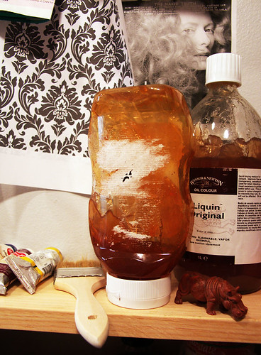
 Old Liquin Bottle (Deceased)
 There was clearly some air communication through the walls of the container, causing a skin to form, but in the basement studio, where the temperature was really controlled and the air a bit humid, it wasn't much of an issue. Scene change to NYC, cue heat wave. The skin formed so fast that it was just a waste, and then the squeeze bottle split up the side in a final throe of death.
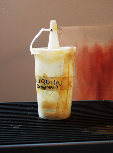
In search of a new bottle -- and quickly -- I came upon an almost-empty ketchup in the fridge, contained in the new Top-Down bottle from Heinz. Thank god for food packaging innovations (I'm only half sarcastic here). It's kind of perfect. The plastic is rigid, not gummy, but squeezable. (I don't know my plastics, but the recycle code on it is 1 and it says "PETE" below. Does that mean it's PET plastic? I don't know. I could probably google it, though. The previous squeeze bottle didn't have a code.) And of course it's meant to stand upside down so it's always ready to dispense. And it has a valve! Actually, the valve has been a bit problematic, because the Liquin has been wanting to separate lately, perhaps because of the heat, but I'm finding a good violent shake does the trick. And the best part is: no skin has formed yet. Even through our patch of 100-plus-degree days. I think I've found a winner.
Heinz Top-Down Bottle Repurposed as Liquin DispenserSecond on the list of neat experiments is a custom oiling-out formula I put together. On the wallpaper painting, I was having a terrible time with glare on the darker edges. Even using my photographer's even lighting we couldn't get it to photograph sufficiently well. Furthermore, this is one of those things that I just have to troubleshoot because it becomes a problem on all my work. Not having had a very good technical painting education, I hadn't heard of oiling out. But, thanks to YouTube, I had subscribed to
Gamblin's feed, and they had recently put out
a video on the topic. (I was on a YouTube kick for a while, so I watched that, and about a million other things, including
Art21's new series, which is totally worth a look.) A good artist-friend of mine had also passed along the tip that Lavender Spike Oil was supposed to reduce shine on dark areas when used as a medium. So I hodge-podged together a recipe for my own oiling-out solution, hoping for a finish would be even and maybe a little satin.
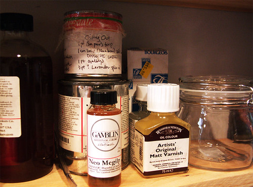 Collection of Painting Mediums
My recipe is as follows:
- 1 part Odorless Mineral Spirits (1 small pour, maybe a tablespoon? two?)
- 1 small lump Cold Wax Medium (lima bean size)
Smash and stir til dissolved.
- 1 part Galkyd
- 1 1/2 or 2 parts Lavender Spike Oil
Then you brush it on evenly and rub it in with a cloth (cheesecloth, ideally) using circular motion.
It definitely seemed to help considerably. Now the painting is at the photographer's again, and I'm awaiting results. She may still have to use polarizing filters to get it just right on film, we'll see. But I have high hopes. And already the in-person experience of it is improved, the colors glow and the corners don't glare. (Storing the leftovers in a tin can with plastic wrap, however, was a failure. I got a glass jar with a rubber seal for storing future batches.)
Development number 3 involved a trip to Ikea. The Brooklyn store is kind of a hell-hole, and that's not just because I'm partial to the Portland one. But we drove out over the Brooklyn Bridge, and coming back into the city the view was just beautiful, so the trip was arguably worth it just for that. It's funny to realize that there's a lot of the city I haven't actually
seen, despite having traveled past/through it, because I'm so often underground. It feels like a strange treat to be in a car.
Anyway, we made the Ikea trip because I've had my eye on the
Bygel cart since before I moved.
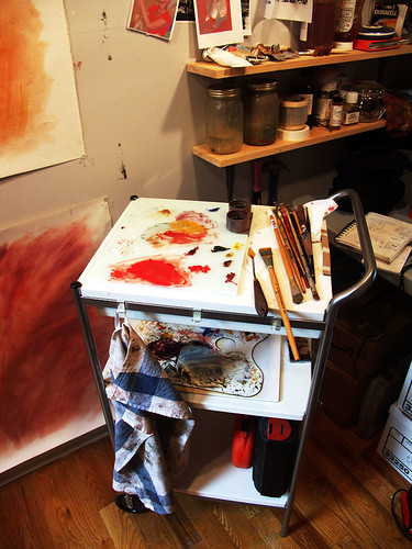 New Painting Cart
 It's very compact, not too rickety, and only $30. Hard to argue. I also got some glass shelves to use as palettes. It's so nice to be mixing on glass again. Plus, I have my desk area back, now that my palette and brushes are all loaded onto the cart. I can't help but miss my old painting cart, with it's 4 swiveling wheels and hugeness, but for my current space this is a vast improvement.
The last and most recent development is that we finally got sufficient air conditioning installed to deal with this heat wave. And it's been glorious. I can finally paint without dripping sweat, and without my paint literally drying on the brush. Oh, a/c, how I love thee.